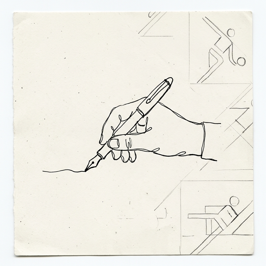
Modern design software has conditioned the human eye to worship sterile vector perfection. Bezier curves are snapped to rigid mathematical grids, gradients are calculated by rendering engines, and every stroke is smoothed until no trace of human hand tremor remains. When apparel graphics begin to look like flawless digital renders, the visual landscape becomes cold, uniform, and instantly forgettable.
For our NINOC graphic releases, we deliberately step backward into the realm of honest imperfection—what we call the naive sketch raw aesthetic. Our illustrators refuse automated stroke smoothing algorithms. We draw directly onto textured paper using pigment ink pens and dry brushwork, preserving organic line-weight fluctuations, micro-bleed textures, and pressure variations right up until the screen-exposure process.
01. Naive Sketch Aesthetics and the Human Imprint
Throughout the lineage of graphic design and visual arts, the most compelling artifacts draw their emotional resonance precisely from organic irregularities captured during manual execution. When an artisan applies brush or pigment pen across coarse paper stock, micro-fluctuations in physical pressure generate distinct line weight variations—delivering moments of rich saturation alongside subtle paper bleed where fibers absorb ink unevenly.
Contemporary vector algorithms inside software suites automatically smooth out and homogenize these organic pressure variances to generate mathematically uniform paths. We view this algorithmic sanitization as a direct erosion of visual character. Consequently, every illustration featured across NINOC apparel originates from raw, manual ink work on 300-gram archival rag paper, scanned at ultra-high optical resolution without altering authentic contour edges.
“A line drawn by a human hand carries the pulse and breathing rhythm of its maker. Algorithmic vector perfection scrubs away the exact humanity that makes clothing meaningful.”
02. Otl Aicher’s Visual Reduction and Pictogram Discipline
Our reductive graphic methodology takes direct inspiration from Otl Aicher’s monumental visual identity and pictogram system engineered for the 1972 Munich Olympics. Aicher demonstrated that complex anatomical mechanics could be distilled into essential, hard-hitting geometric silhouettes that communicate instantly across language barriers while retaining profound formal dignity.
We apply this exact reductive discipline when composing apparel graphics. We strip away superfluous digital drop shadows, eliminate ornamental clutter lacking narrative purpose, and preserve bold, monochromatic structural linework capable of commanding immediate visual authority from five meters away.
03. High-Solid Plastisol Screen Printing on 24s Cotton
Regardless of an illustration's compositional brilliance, its tactile value collapses if transferred onto fabric through compromised production methods. Within our Bandung printing bays, we reject superficial Direct-to-Garment (DTG) inkjet printing techniques that deposit thin, synthetic surface films prone to rapid fading and peeling after routine wash cycles.
We deploy traditional high-tension manual screen printing utilizing industrial-grade, high-solid plastisol inks. Each color pass is driven firmly into the open grain of our 24s combed cotton jersey using 75-durometer polyurethane squeegees under consistent mechanical pressure. The resulting print exhibits a rich, dimensional relief that interlocks physically with the cotton substrate—resisting cracking under tensile stretch while developing an exceptional, lived-in patina across sustained years of wear.